Colour is one of the hardest parts of turning artwork into a custom cotton tea towel. A design can look confident on screen, softer in a PDF proof, and different again once it is printed on woven cotton.
That does not mean colour proofing is useless. It means the proof needs to be read in the right way.
For artists, designers, gift shops and small brands, a digital sample or proof can help you make better decisions before production. It can show whether the artwork direction is practical, whether the layout feels balanced, and whether any colours or details need a closer look. It cannot promise that a cotton tea towel will look exactly like a backlit screen.
At BLANC Tea Towel, we usually treat colour proofing as a practical conversation, not a guarantee of perfect screen matching. This guide explains what a digital sample can and cannot tell you when planning 100% cotton custom tea towels.
Why Colour Changes Between Screen and Cotton
Screens make colour with light. Cotton tea towels show colour through ink or dye sitting with the texture of fabric. Those two surfaces behave differently.
A bright teal, soft peach, deep navy or pale yellow may feel clean and flat on a monitor. On cotton, the same colour has to work with yarn texture, absorbency, print method, lighting and the natural warmth of the base cloth. Fine lines can also soften slightly because the towel is a fabric product, not a sheet of coated paper.
This is why a proof should be used to reduce risk, not to pretend that fabric is the same as a screen.
For detailed artwork, the custom digital printed tea towels page is the main place to start. It explains how full-colour artwork, fine lines and cotton fabric need to be considered together.
What a Digital Sample Can Confirm
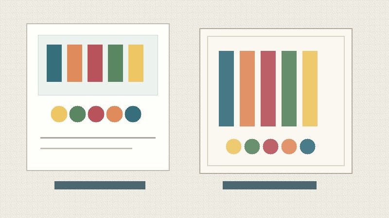
A digital proof or sample can still answer several useful questions before you move ahead.
It can help confirm whether the overall artwork direction makes sense for a tea towel. You can see if the design feels balanced at the intended size, whether the border is too close to the edge, and whether the main motif sits in a good place when the towel is viewed as a product.
It can also reveal practical artwork issues. Pale colours may not have enough contrast. Small text may need to be enlarged. A dark background may hide subtle linework. A busy repeat may need more spacing. A watercolour-style illustration may need a little more strength to hold up on cotton.
Useful things a proof can help check include:
- General colour direction
- Contrast between light and dark areas
- Small text, signatures and fine lines
- Border placement and safe area
- Repeat scale or full-towel layout
- Whether the design still works when folded
- Whether a sample is worth discussing before a larger order
For many projects, this is enough to avoid obvious mistakes. The proof gives everyone a shared reference point, which is much better than trying to judge a tea towel project only from a small phone image.
What a Digital Sample Cannot Fully Promise
A digital sample cannot fully promise exact screen-to-fabric colour. It also cannot show every possible effect of lighting, washing, daily use or different monitor settings.
This matters most when a design depends on very subtle colour differences. For example, two soft beige tones may look separate on screen but feel closer on cotton. A dark green and dark blue may lose separation if the contrast is too low. A pale yellow may look warm and gentle on a monitor, but too quiet on fabric if the surrounding colours are also light.
A proof also cannot fix artwork that is not prepared at the right size or resolution. If the original file is too small, blurry or compressed, the proof may reveal the problem, but it cannot make the source artwork sharp again.
So the better question is not “Will the proof be exact?” It is “What decisions can this proof help us make before production?”
When Colour Proofing Is Especially Worth It
Colour proofing is most useful when colour is part of the product value.
An artist selling tea towels in an online shop may care about whether the printed towel still feels like their artwork. A museum or gallery shop may need the colour mood to respect the original piece. A cafe or food brand may want the tea towel to sit comfortably beside packaging, menus or labels. A school or fundraising project may need names and drawings to stay clear rather than perfectly colour-matched.
It is worth discussing a proof or sample when:
- The artwork uses many colours or gradients
- The design has pale tones, dark tones or subtle texture
- Small details need to stay readable
- The towel will be sold retail, not only used as a giveaway
- The artwork belongs to a larger product range
- The project has a fixed launch, exhibition or event date
If the order is a simple logo, strong line drawing or bold one-colour design, the proofing conversation may be simpler. If the design is a full-colour illustration, painterly artwork or retail product, proofing usually deserves more attention.
How to Review a Proof Without Overreacting
The easiest mistake is to judge a proof like a final art print. A tea towel is a textile product. It should be checked for usefulness, clarity and overall product feel, not only for whether a colour chip matches a screen.
When reviewing a proof, look at the design in this order:
- Does the artwork still feel like the right product?
- Are the main shapes and details clear at tea towel scale?
- Is the contrast strong enough for cotton?
- Are important colours close enough to the intended mood?
- Does anything need changing before sample or production?
This keeps the review practical. A small shift in colour temperature may be acceptable if the design still feels beautiful and useful. A tiny line becoming unreadable is more important. A border sitting too close to the hem is more important. A main motif disappearing under a fold or belly band is more important.
The broader custom tea towels page can help if you are still deciding fabric, size, quantity or packaging before asking for a quote.
What to Send Before Asking for a Colour Check
You do not need a perfect technical brief, but a little context helps the review focus on the right risk.
Before asking about tea towel colour proofing, send:
- The best artwork preview you have
- Final file type and size, if known
- Intended towel size
- Quantity range and number of designs
- Any colours that must stay close to the original
- Notes about small text, signatures, borders or fine lines
- Whether the towel will be sold retail, gifted, used in a school project or used by a brand
- Packaging or folded display plans
- Delivery country and target date, if timing matters
If one colour is especially important, say that clearly. If you are flexible about the exact shade but care about the overall mood, say that too. Those two projects should not be reviewed in the same way.
Cotton First, With Honest Expectations
BLANC Tea Towel’s main line is 100% cotton custom tea towels. Cotton is practical, familiar and well suited to artwork-led products for artists, gift shops, schools, cafes and small brands.
The tradeoff is that cotton has its own surface. It gives the finished towel a softer, more tactile quality, but it also means colour should be reviewed with fabric expectations. A custom printed cotton tea towel should look intentional, clear and useful. It does not need to behave like a glossy poster.
That honest expectation usually leads to better decisions. Instead of chasing a perfect screen match, you can focus on the parts that affect the finished product most: contrast, scale, line clarity, borders, folds, packaging and the main colour mood.
Next Step: Send the Artwork and Colour Priorities
If colour accuracy or proofing is a concern for your custom tea towel project, send BLANC Tea Towel the artwork preview, quantity range, intended use, preferred size, delivery country and the colours or details you are most worried about through the contact form.
If the artwork is still in progress, that is fine. A draft can still be useful for an early review, especially when the question is about colour strength, contrast, small details or whether a sample is worth discussing.
FAQ
Can a digital proof show the exact final tea towel colour?
No. A digital proof can show the general colour direction, layout and artwork risks, but it cannot promise exact screen-to-cotton colour. Cotton texture, print method, lighting and monitor settings all affect how colour is perceived.
When should artists request a custom tea towel sample?
A sample is worth discussing when the artwork has subtle colour, fine detail, small text, dark tones, pale tones or important retail presentation needs. It is also useful when the towel will become part of a product range.
What colour issues are most common on cotton tea towels?
Common issues include low contrast, pale colours looking too quiet, small text softening, dark details blending together and borders sitting too close to the edge. A proof can help catch these before production.
Should I change my artwork before sending it for review?
Not always. Send the best preview you have first. If the design has obvious concerns, such as tiny lettering or very subtle colour differences, mention them so the review can focus on those areas.
What should I send for tea towel colour proofing?
Send the artwork preview, intended size, quantity range, number of designs, important colours, notes about small text or fine lines, intended use, packaging plans, delivery country and any deadline.