School artwork layouts look friendly on screen, but cotton printing asks a slightly different question: will the drawings, names, borders, and class message still be clear when they become a real tea towel?
This school tea towels Australia printing guide is for schools, kindergartens, teachers, parent groups, and community organisers who are preparing class artwork for 100% cotton custom tea towels. It is not meant to make the project feel technical for the sake of it. The goal is simpler: help you spot layout problems early, before the artwork is approved and sent for printing.
When schools contact us, the artwork is often still changing. That is fine. A draft can start the conversation. But if you understand what affects print clarity, your first version is much more likely to become a smooth quote and proofing process.
For a broader project overview, you can also read BLANC Tea Towel's school tea towels product page and our recent school tea towels Australia buyer guide.
Start with readability, not decoration
The most common mistake in school artwork layouts is trying to include everything at the same size and importance. A class tea towel may need children's drawings, names, a school name, a year, a teacher name, a class title, a border, and sometimes a fundraising message. If everything is treated as equally important, the finished towel can feel crowded.
Before you collect every drawing, decide what must be readable first.
For many school tea towels, the priority order is:
- Child names
- Child drawings or portraits
- School or kindergarten name
- Class year or event name
- Teacher names, if included
- Decorative borders or extra icons
This order is not fixed, but it helps. If names are the reason families will buy or keep the tea towel, those names need enough space. If the school logo is the hero, the student artwork may need to sit around it rather than compete with it.
A beautiful layout is not always the most useful layout. For class projects, clear usually beats clever.
Layout choices that affect cotton printing
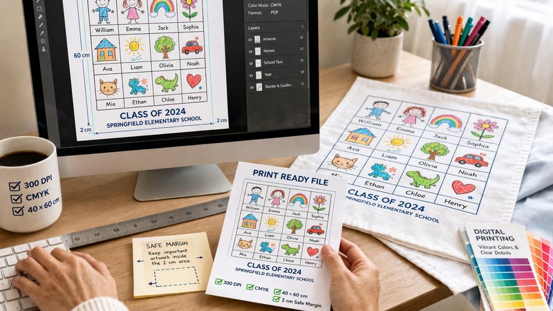
Cotton is not a phone screen or a sheet of glossy paper. It has texture, movement, folds, and a softer surface. That does not mean school artwork cannot print well. It means the layout should allow for the way fabric behaves.
There are a few layout choices we usually check first.
Drawing size
Small drawings can look clear when viewed close up on a screen, then feel weaker on fabric. If a child's drawing has tiny eyelashes, small handwriting, or very fine pencil lines, those details may not carry the same weight once printed.
The safer approach is to give each drawing enough space and avoid shrinking artwork just to fit more items into one area.
Name size
Names are often more important than organisers expect. Families will look for them immediately. If names are too small, squeezed under drawings, or placed too close to borders, the towel may still look attractive but feel less satisfying as a class keepsake.
Typed names are usually easier to control. Handwritten names can feel personal, but they should be checked for clarity and spelling before the final proof is approved.
Borders and margins
Borders can make a tea towel feel complete, especially for school projects. But borders also need breathing room. If important drawings or names sit too close to the edge, the layout can look tight after hemming, folding, or normal fabric movement.
Keep the most important details away from the outer edge. If you are not sure how much safe space to allow, send the draft layout and ask for a print check before the artwork is final.
Colour contrast
Children's artwork is often soft and light. Pale pencil, very light yellow, faint pastel, or thin grey lines may look charming on paper but weak on cotton. Stronger contrast is usually easier to read.
That does not mean every design needs heavy black lines. It simply means the artwork should be checked at the real printed scale, not only enlarged on a screen.
Grid, collage, or centred design?
Most school artwork layouts fit into one of three broad structures.
A grid layout is usually the easiest to read. Each child has a defined space, and names can sit below or beside the drawing. It feels orderly, which can be helpful for schools and kindergartens where every child should be represented evenly.
A collage layout can feel more lively and handmade. Drawings may sit at different angles or wrap around a central title. This can be lovely, but it needs careful spacing so the layout does not become visually noisy.
A centred design places the school name, logo, building, mascot, or event message in the middle, with student artwork around it. This can work when the class identity is just as important as each individual drawing.
If you are deciding between styles, read the previous use case guide: Class Artwork Tea Towel Projects. It explains how project purpose can guide layout decisions.
How digital printing affects the result
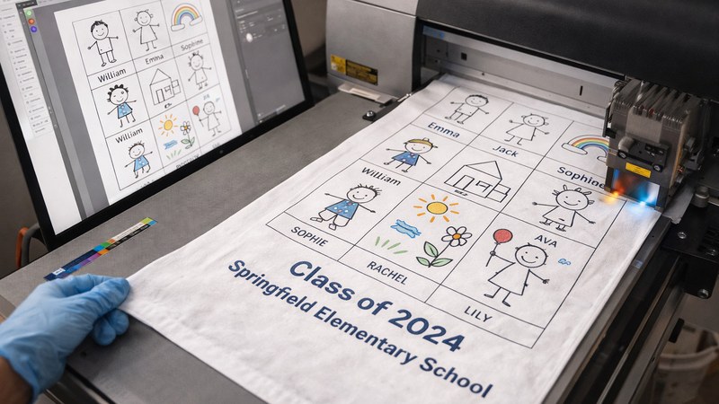
Digital printing can be a good fit for school tea towels when the artwork includes many colours, drawings, names, and small variations. It can help preserve the feeling of children's artwork without reducing everything to one or two colours.
Still, digital printing is not magic. The source file matters. A clear scan, balanced layout, readable names, and sensible artwork size will usually give the print a better starting point than a low-light photo or crowded screenshot.
For custom digital printed tea towels, we usually look at whether the artwork has enough resolution, whether the lines are clean, and whether important text will remain readable at the final towel size.
If the design contains many drawings, a physical sample can be worth discussing. A sample helps the school check cotton feel, colour impression, line clarity, and overall scale before approving the full project.
Common layout problems to fix early
Most artwork issues are easier to solve before the final proof. Once a school has collected family orders or announced a design, changes can become more stressful.
These are the problems worth checking early:
- Too many drawings in one small area
- Names placed too close to drawing edges
- Very pale pencil lines or low contrast artwork
- Scans or photos with shadows across the page
- Mixed artwork sizes that make some children look more prominent than others
- Decorative borders taking space away from the actual class artwork
- Important text sitting too close to the towel edge
- A class year or school name that is too small when viewed at the final size
One practical test is to print the draft layout on paper at a reduced scale and stand back from it. If the names already feel hard to read on paper, they will need attention before cotton printing.
Another useful test is to view the layout on a screen at roughly the same size as the printed towel area. Do not only zoom in. Zoomed-in artwork can hide spacing problems.
What schools should send before production
You do not need a perfect file to ask for a print check. A useful early message can include a draft layout and a few notes about the project.
Before production, it helps to send:
- The draft artwork file or layout preview
- The number of children, classes, or designs
- Whether names are handwritten or typed
- The school or kindergarten name exactly as it should appear
- The class year, event name, or teacher names, if included
- Preferred tea towel size, if already known
- Delivery country and city
- Expected quantity range
- Sample questions, if the design has small details or many colours
- Packaging needs, if the tea towels will be sold or gifted
If your artwork is still rough, that is okay. Say that it is a draft. We can still look at the structure and point out the questions that may matter before final file preparation.
For more detailed file guidance, see How Artists Should Send Files For A Custom Printed Cotton Tea Towel Quote. The article is written for artists, but the same thinking helps school artwork: clear files, readable details, and enough context for a useful quote.
A calmer way to approve the proof
Proof checking is where many school projects slow down. It is also where a simple system helps.
Before approving the final proof, choose one person to collect corrections. Ask them to check the layout against the name list, class list, school spelling, and event details. This avoids five different people sending partial corrections in different messages.
Check the proof for:
- Spelling of every child name
- Correct school or kindergarten name
- Correct year, class, or event wording
- Missing drawings or repeated drawings
- Whether all names are readable
- Whether the layout still has enough margin
- Whether the finished towel will make sense when folded
This step is not glamorous, but it protects the emotional value of the project. A class tea towel is personal. Small mistakes feel bigger when families are looking for a child's name.
Next step: send artwork for a print check
If you are preparing school tea towels in Australia and want to check whether the artwork layout is ready, send BLANC Tea Towel your draft file, quantity range, delivery location, and notes about names, samples, packaging, and timing.
You can also start from the main custom tea towels page if the project includes other artwork types, school shop products, or future designs beyond one class tea towel.
The best first step is simple: share what you have, even if it is not final. A draft layout is enough for us to help you see whether the school artwork is moving toward a clear, printable cotton tea towel.
FAQ
What makes a school artwork layout print well on cotton tea towels?
A clear layout, readable names, strong enough line contrast, enough space around important details, and a practical final size all help school artwork print better on cotton tea towels.
Is a grid layout better than a collage layout for school tea towels?
A grid layout is usually easier to read because each child has a clear space. A collage layout can feel more creative, but it needs careful spacing so names and drawings do not become crowded.
Do schools need high-resolution artwork before asking for a quote?
Not always. A draft layout or preview can start the conversation. Before production, the artwork should be checked for resolution, line clarity, readable names, and final print size.
Can digital printing handle colourful children's artwork?
Digital printing can be suitable for colourful class artwork with many drawings and names, but the source file still matters. Clear scans, good contrast, and a balanced layout help the result.
What should schools send for a print check?
Send the draft artwork or layout preview, number of children or designs, name list approach, delivery country, quantity range, preferred towel size if known, sample questions, packaging needs, and any event deadline.