‘Since teacloths are a fairly cheap and expendable product, the design of them can be experimental. When paying a small amount of money for something that is not going to have a very long life, people are prepared to take a risk and buy exciting designs.’
— PAT ALBECK, TEXTILE DESIGNER
ALTHOUGH contemporary style remained a continuing influence throughout the early 1960s, by 1964 the look of the post-war period segued into a fresher, more vibrant aesthetic, spearheaded by a coterie of youthful designers. The emergence of pop culture and the youth revolution led to the elevation of colour and pattern over form, and large-scale single motifs and geometric, flat, stylized florals appeared alongside the visual distortions of the Op-Art-inspired patterns of artists such Bridget Riley and Victor Vasarely. Reproductions of the red, white and blue Union flag appeared alongside target and bull’s eye motifs utilized by the Pop Art movement, which assembled cultural icons and found objects and transformed them into high art.
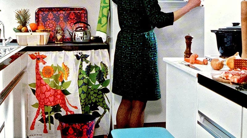
Full employment led to a consumer revolution and the young middle classes aspired to a different kind of kitchen than that of their parents. Couples setting up home had an awareness of modern design. Women, in the main back in the workplace, at least until children were born. now rejected the boredom of the mechanized kitchen and expected to share domestic duties with their husband. Cooking, shared by both partners, became a significant leisure pursuit prompted in part by the influential food writer Elizabeth David who opened a shop selling imported kitchen equipment in London in 1965.
Shopping became a destination experience with the blossoming of fashion boutiques, such as trend-setting Mary Quant’s Bazaar and the opening of Terence Conran’s Habitat in 1964. The designer and entrepreneur was on a mission to reform domestic design in Britain, and the store featured simple and unpretentious artifacts like unglazed pots, wicker baskets, simple batterie de cuisine and chicken brick. Habitat‘s interiors with their whitewash brick walls, quarry tiles, spotlights, stripped pine and open shelving units were to become highly influential. The catalog, introduced in 1966 and designed by Juliet Glynn-Smith, who also designed textiles including tea towels for the company, made these products accessible to those living outside London. Tea towels began to be produced with matching products, including oven gloves aprons, table napkins, enameled tin trays and cast-iron casserole dishes, to provide a cohesive look.
Heal Fabrics, introduced in the 1940s as an offshoot of the furniture and furnishings store Heal & Son, was at the forefront of textile design innovation. Led by Tom Worthington, the firm’s managing director from 1948-71, the company averaged 30 new designs a year. Worthington built up relationships with young designers such as Barbara Brown, a graduate of London’s Royal College of Art and Heal’ s most high-profile designer. Her adoption of larger-scale precise geometric forms and undisguised repetition was in contrast to the more free-flowing aesthetic of
Jyoti Bhomik. Born in India, Bhomik designed exclusively for Heal’s in the 1960s, purveying an aesthetic inspired by the colours and patterns found in the Indian sub-continent. Towards the end the decade, print design evoked images purloined from other cultures, fuelled by the popularity of the hippie trail to India, Morocco and the Far East.
Heal’s main rival for experimental design was Hull Traders, whose fabrics were marketed under the brand name Time Present. Under the auspices of design and colour consultant Shirley Craven, the fabrics were hand screen-printed using mainly pigment dyes – which float on the surface of the cloth unlike vat dyes that penetrate the cloth -allowing the company to produce short runs of experimental designs. Shirley Craven became a director of the company in 1963 in addition to her role as chief designer.
Designer Pat Albeck worked for the John Lewis Partnership, under its own brand name, Jonelle, which was launched in 1937. Albeck, an alumnus of the Royal College of Art, produced work in her freelance portfolio for a diverse range of clients including the National Trust, Sekers, Marks Spencer and Sanderson. During this period, she was asked by John Lewis to produce a design based on the patterns of William Morris -her response was Daisy Cbain – printed in several colourways. This became its best seller for 15 years, and in 2014 was reworked to celebrate the 150th anniversary of the store.
The Modernism of the early 1960s was discarded with the counter-revolution of 1968 when historical revivalism resulted in an eclectic appropriation of the past. Changes in trends accelerated as the decade progressed, although flat florals continued to have a popular appeal as a diffused domestic engagement with flower power.
The 1960s heralded a golden age of poster art. It defined the aesthetic of the counter-culture revolution and represented a youth culture undergoing psychedelic enlightenment with the use of LSD, a hallucinogenic drug that introduced pharmacological turmoil to the visual arts. The burgeoning hippie movement eagerly embraced this new psychedelic graphic style, which resulted in kaleidoscopic patterns, distorted fonts and heightened vibrant colours, all of which contributed to the broad visual language of the period. This distinctive style was necessarily diffused and domesticated by the contemporary kitchen textile market, one of the leading exponents of the genre being designer Ian Logan. Together with a group of textile design students from the Central School of Art and Design (now Central St Martins), Logan formed a small fabric print company called JRM Design, producing prints for fashion designers Mary Quant and Jeff Banks. The company also produced designs on cushions tablecloths and tea towels.
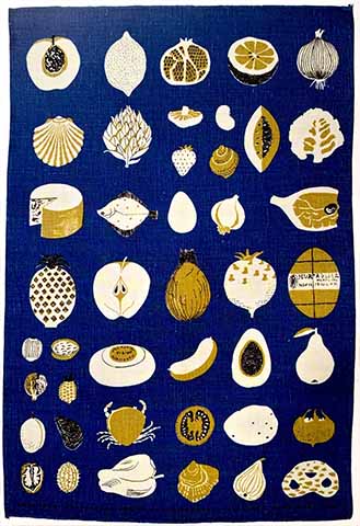
Good Food was designed by Lucienne Day for Fragonard in 1961-2 Effected with linocut simplicity, this tea towel depicts an eclectic range of culinary constituents from oysters to the humble tomato.
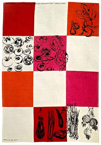
By the hand of Lucienne Day for Fragonard, a simple colour tiled chequerboard readily suggests a backdrop for the food of a Provencal kitchen-tapenade, pistou, ratatouille and fresh figs.
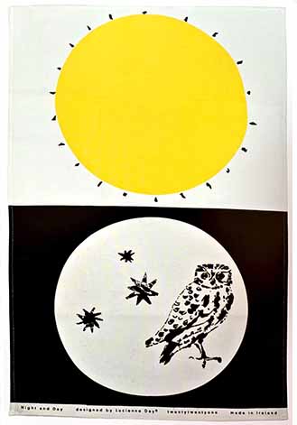
Lucienne Day exploits the release from repeat-pattern obligations to compose a canvas of yin and yang graphic simplicity, wittily defining the temporal dichotomy of sun and moon.
Made in Ireland using 100% linen, the design was originally launched in 1962.
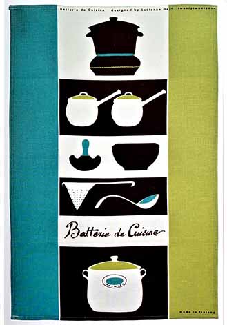
Ron Crawford. a director of Belfast firm Nova Products, originally commissioned Batterie de Cuisine in the 1960s. The language and kitchenalia chosen by Day set this glass cloth firmly in the idiom of adherents of food writer Elizabeth David.
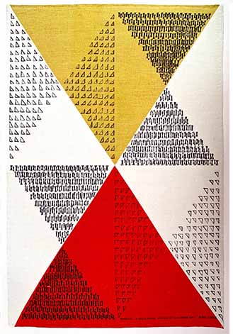
Diabolo is a Lucienne Day design from 1962. The opposed delta colour motif is fragmented by additional geometric fields of angular textures, creating depth and visual dynamism, akin to the abstract patterning of Paul Klee.
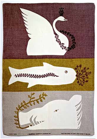
Ancient regal banquet prerogatives of garnished swan, pond carp and disembodied wild boar are asserted in Lucienne Day’s Tudor Table design for best linen brand. The paper stencil approach gives a cartoonish simplicity to the reversed-out animal forms.
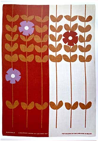
Well-behaved Vinca major tendrils are held to attention astride a regimented colour stripe. In 1964 Lucienne Day created Periwinkle in three bold screen separations for best linen brand.
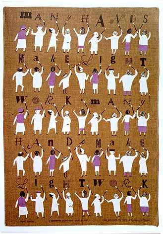
Lucienne Day populates her pattern-striped frieze with animated and light-hearted visual playfulness and a potpourri of typefaces in her best linen brand design, Many Hands Make Light Work, of 1964.
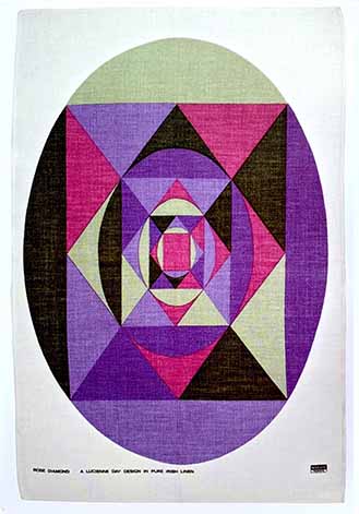
Making graphic reference to the phenomenon of crystalline diffraction, as harnessed by skilled diamond cutters, Lucienne Day creates a spectral illusion of faceted depth in her Rose Diamond design of 1969 for Nova Products.
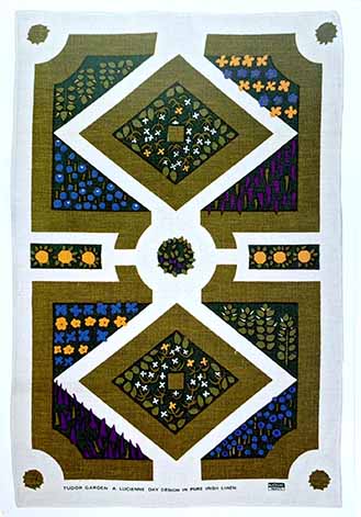
Tudor Garden by Lucienne Day casts a bird’s eye view over a formal parterre. Banded inbox to segregate lupin from lily, the strict geometry and horticultural palette amount to a striking graphic in this design for Nova Products.
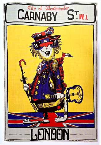
From genesis in 1965 to final demise in 1977, the boutique brand, I was Lord Kitchener’s Valet, provided a shorthand for all things retail inherent in the Swinging Sixties of London.
In this diffusion merchandise item from its latter-day decline, the brand satirizes its own psychedelic heritage of ironic subversion of historic military costume in tandem with noting the clichéd tourist location off Regent Street.
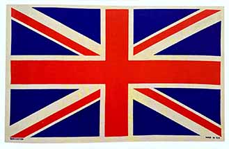
1965 Pete Townsend of The Who donned the Union Flag in jacket form to go with the 1966 launch of their single, ‘The Kids are Alright’. An expression of subversive Op-Art sensitivity rather than a jingoistic salute to queen and country, the fragmented red, white and blue graphic has had numerous reincarnations in popular culture.
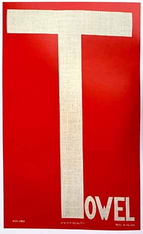
The T-towel is an unapologetic play upon visual and typographic tautology.
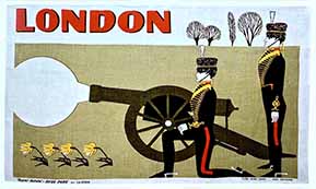
On special anniversaries and birthdays, Royal Gun Salutes are fired from various London locations. Here the Kings Troop Royal Horse Artillery is rendered as fashionably ‘mod’. Military uniforms were popular items in the Carnaby Street emporium, I was Lord Kitchener’s Valet.
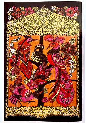
Rendered in a vibrant contemporary colorway with complex patterning and framed within a dark background, Birdcage by Ulster Weavers has the impact of the multi-textured psychedelic poster, pioneered in the USA by graphic artists such as Wes Wilson.
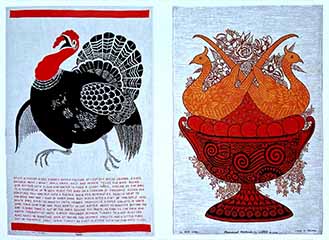
Above left: Rightfully alarmed, a vocal turkey takes fright and fails flight as it scrambles above an exotic recipe for Christmas dinner that includes roasting the bird with pineapple slices and a pint of warm, dark rum.
Above right: Evoking the prevailing interest in the Victorian revival that occurred in the late 1960s, Pheasant Fantasia by Ulster Weavers illustrates a typical formal centerpiece found on 19th-century dining tables.
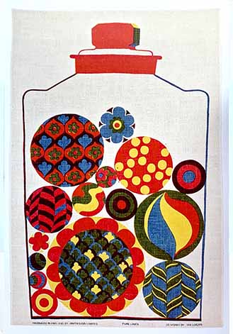
Designed by lan Logan, Candy Jar features baubles, marbles and bullseyes, animated by disparate richly hued patterns- swirls, spots, hearts and daisies- contained within a glass-stoppered jar.
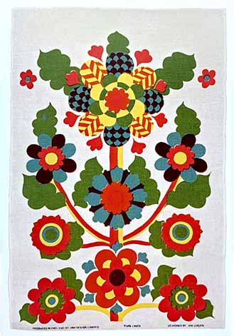
In a classic Pop-Art vs. Op-Art 1960s confusion, lan Logan’s Floribunda design enhances stylized generic florals with vivid colours and shifting, Kaleidoscopic patterns.
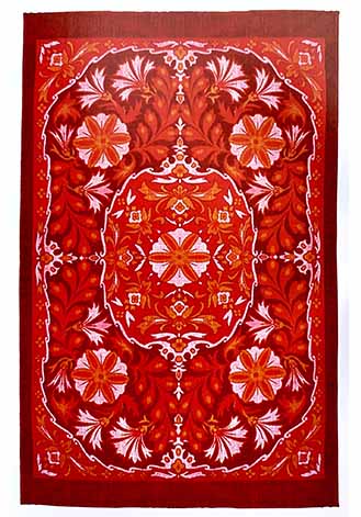
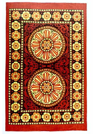
With its rich hues and intense patterning of acanthus intertwined with morning glory, this design is redolent of Middle Eastern rugs and suggestive of anesthetic from the Indian sub-continent, a popular destination on the ‘hippie trail’.
In a recollection of the lotus mandala, a transcendental metaphor of heightened spirituality surmounting the material in both Hinduism and Buddhism; this design reflects a prevailing interest in all things Eastern.
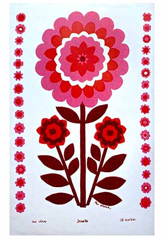
The archetypal ’60s flower, the daisy, is rendered in flat, graphic form by Pat Albeck for Jonelle, the own-label brand of the John Lewis Partnership, a high-end department store.
It was printed by a then John Lewis subsidiary, Stead McAlpin, based in Cummersdale.
The Causeway trademark belonged to Henry’s(Belfast)Ltd. and ran from the early’60s until the late’90s. This linen and cotton product asserts that it is printed with vat colours, a process patented by E. L.Du Pont de Nemours& Co in 1952.
《the art of the tea towel》
Marnie Fogg