Colour and fine lines are small details until you are trying to turn artwork into a real cotton tea towel. Then they become the questions that decide whether a design feels clear, soft, readable, or too delicate for the product.
Artists and illustrators often ask us some version of the same thing: will my colours stay lively, and will my small details still show on fabric?
This digital printed tea towels printing guide is written for artwork-led projects where colour, texture, linework, small text, or subtle shading matters. It is not a lab manual. It is a practical way to think before you send artwork for a quote, sample, or print check.
The short answer
Digital printing is often a good direction for full-colour artwork, painterly illustration, soft gradients, maps, recipes, and detailed surface patterns. It can carry more visual information than a simple one-colour or two-colour print.
But cotton is not paper and it is not a screen. The fabric surface can make colours feel softer, very thin lines less sharp, and tiny text harder to read if the artwork is not prepared with the final product in mind.
The goal is not to make artists afraid of detail. The goal is to know which details need checking before production.
For full-colour artwork direction, many artists start with custom digital printed tea towels because the method is well suited to illustrated, multi-colour designs.
Why colour behaves differently on cotton
On a monitor, colour is lit from behind. On cotton, colour sits on a woven, absorbent surface. That alone changes how artwork feels.
A bright blue may still look bright, but it will not feel exactly like a backlit screen. A pale yellow may need enough strength to avoid disappearing. A dark background may need enough contrast so small artwork details do not get lost.
When customers send us artwork with important colour, we usually look at:
- Pale colours and soft backgrounds
- Dark areas that still need visible detail
- Fine colour changes or gradients
- Painterly textures and brush marks
- Brand colours or gallery colours that matter
- Large flat colour areas that need to feel even
Colour does not need to be perfect in the abstract. It needs to work for the finished cotton tea towel: open, folded, photographed, displayed, and used.
Fine lines need room to breathe
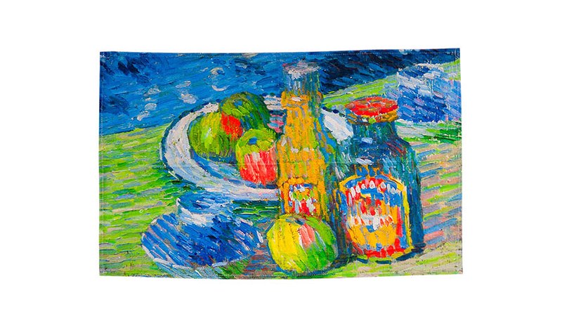
Fine lines can print beautifully, but they should not be treated like lines on a phone screen.
Cotton has texture. That texture is part of why tea towels feel warm and useful, but it also means very narrow linework may soften. If the line is pale, surrounded by busy colour, or placed inside a dark area, it may need extra attention.
Fine lines are common in:
- Botanical drawings
- Hand lettering
- City maps and place names
- Food illustrations
- Recipe layouts
- Character details
- Signatures and artist marks
- Repeat patterns with small motifs
Before production, ask which lines are decorative and which lines are essential. A tiny background mark can soften without hurting the design. A small place name or signature may need to stay readable.
That difference matters.
Small text is a separate check
Small text deserves its own review. It is one of the easiest things to underestimate.
Text may look readable in a design file because you can zoom in. A shopper, gift recipient, or gallery visitor will not read the towel that way. They will see it at arm's length, folded on a table, hanging in a shop, or photographed online.
If the artwork includes words, check:
- Letter height
- Spacing between letters
- Contrast between text and background
- Whether the text sits on a busy texture
- Whether it will be folded or covered by packaging
- Whether the words are decorative or need to be read
A recipe, poem, map label, school name, artist signature, or date may all need different treatment.
For a deeper artwork-preparation checklist, read How Artists Should Send Files For A Custom Printed Cotton Tea Towel Quote.
Common colour and line mistakes to avoid
Most problems are not dramatic. They are small choices that become visible only after the artwork is placed on a product.
Watch for these:
- Pale text on a pale background
- Fine linework over a textured or busy area
- Very dark artwork with small details hidden inside it
- A border placed too close to the finished towel edge
- A detailed design scaled down too far
- Large flat colour areas with no visual breathing room
- Important artwork hidden in the folded view
- A mockup that looks good but is too low resolution for production
If any of these appear in your design, it does not mean the project should stop. It means the file should be reviewed before quote finalisation, sample production, or full production.
For more detail-focused guidance, see Artwork Detail On Digitally Printed Cotton Tea Towels.
When a sample is useful
A sample can be worth discussing when the design depends on colour, small text, fine lines, or subtle contrast.
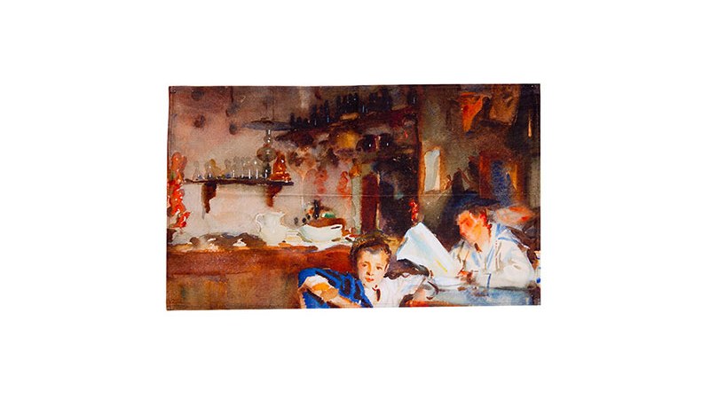
For artists and illustrators, a sample is not only about checking whether the print "worked". It helps you see the real towel as a product: fabric feel, artwork scale, colour mood, edge finish, and how it looks when folded.
A sample may be especially helpful if:
- The towel will sell in a gallery shop, museum shop, gift shop, or artist store
- The design includes readable text
- The artwork has subtle colour changes
- The product may be reordered later
- Packaging or folded presentation matters
- The design is part of a wider product range
You do not need a sample for every project, but it is a useful conversation when the artwork has important details.
What to send before a print check
If you want useful feedback, send the artwork and the product context together.
A good first message can include:
- A JPG or PNG preview
- The final file type, if available
- The number of designs
- Preferred towel size, or a note asking for advice
- Quantity range
- Any colours that matter
- Notes about small text, maps, signatures, or fine lines
- Whether you want a sample
- Packaging idea, if the towel will be sold retail
- Delivery country
For custom tea towels, the same artwork can behave differently depending on size, layout, fold, packaging, and use. Sharing those details early helps us give more practical feedback.
How packaging changes the colour and line conversation
Packaging may seem separate from print quality, but it can change which part of the design people see first.
If the towel is folded with a belly band, a fine line or small title might end up hidden. If the towel is hung, the top section may become more important. If the towel is sold online, the open product image may matter most.
Before production, think about:
- Which part of the artwork should be visible when folded
- Whether the title or artist name belongs on the towel or packaging
- Whether a hang tag, belly band, or label will cover anything important
- Whether the strongest colour area will show in retail display
- Whether the design still makes sense in product photos
This is why artwork review and product planning belong together.
For more on retail product planning, read Turning Artwork Into Retail Products With Custom Printed Cotton Tea Towels.
How BLANC Tea Towel can help
BLANC Tea Towel works with artists, illustrators, designers, gift shops, museum shops, cafes, schools, events, and small brands preparing custom printed cotton tea towels.
For digital printed tea towels, we can help review:
- Colour direction
- Fine line and small text risk
- Artwork scale
- Full-towel or bordered layout
- Sample questions
- Packaging and folded presentation
- Quantity range and delivery-country details
If colour and fine lines matter in your design, send the artwork preview, quantity range, preferred size, packaging idea, delivery country, and any notes about text or detail. We can help you decide what should be checked before the next step.
For a broader buying path, see How To Buy Digital Printed Tea Towels For Artists And Illustrators.
FAQ
Does digital printing keep fine lines sharp on cotton tea towels?
Digital printing can handle fine artwork, but very thin lines should be checked on cotton fabric. Line weight, colour contrast, surrounding texture, and final print size all affect readability.
Will colours on a cotton tea towel match my screen exactly?
Screen colour and printed cotton colour are not the same. Cotton can make colour feel softer than a backlit screen, so important colours should be discussed and, when needed, checked with a sample.
What artwork details should artists flag before production?
Artists should flag small text, fine lines, pale colours, dark areas with subtle detail, borders near the towel edge, signatures, maps, repeat joins, and artwork that must look good when folded.
Is a sample useful for digital printed tea towels?
A sample can be useful when colour, fine linework, small text, fabric feel, or retail presentation matters. It helps you judge the real product before moving into a larger order.
What should I send for a digital printed tea towel print check?
Send an artwork preview, number of designs, preferred size, quantity range, delivery country, packaging idea, sample question, and notes about colour, small text, fine lines, or important details.